ORBIT
A Location-Sharing App for Shared Experiences
Project Overview
We've all been there. You're at a music festival with eight friends, someone wanders off to grab a drink, another disappears toward a food truck, and suddenly you're standing alone in a sea of strangers with 40% battery and no idea where anyone went. Group chats spiral. Calls go unanswered. And one poor soul — usually me — becomes the group's human GPS for the rest of the day.
That frustration became the seed for Orbit, a location-sharing app designed specifically for shared experiences rather than everyday life.
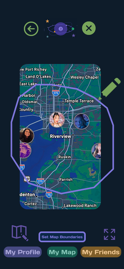
Orbit lets users share their location only for the duration of an event. Users draw a custom radius around a venue — a festival ground, a beach, a park — and the moment they step outside that boundary, sharing ends automatically. No lingering permissions. No "wait, is she still tracking me?" moments the next day.
This automatic boundary reflects user control and freedom the user defines the exit before they ever need it, and the system honors that decision without requiring further action.
Research Methods & Planning
Why This Space?
Before designing anything, I wanted to understand whether this was a real problem or just my own personal grievance. The numbers made it clear:
62% of Americans share their location with others.
75% of Gen Z (ages 18–29) actively enable location sharing.
65% of Gen Z adults share with at least one contact, often many more.
Location sharing is no longer niche — it's a daily habit. But the way people share hasn't evolved much. Most tools treat it as an on/off switch, when real life is far more nuanced.
Competitive Analysis
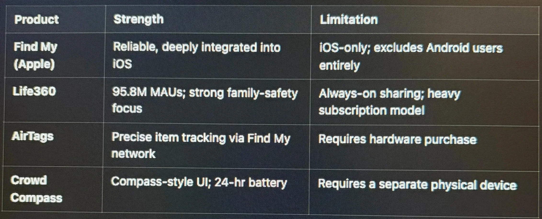
I audited four leading products to see what gaps existed in the market.
The gap I found: Every product I studied treated location sharing as permanent. There was no elegant middle ground for people who wanted to share during a specific event and then quietly return to privacy. No other app has a feature for only sharing location for a week. the time frames are typically either share for one hour or indefinitely, Orbit lives in that middle ground.
Conducting Research
Participant Recruitment
I distributed a screener survey that doubled as a recruitment funnel — a small design decision that saved a huge amount of time.
9 survey respondents, ages 25–40
All active users of at least one location-sharing app
5 selected for in-depth interviews
Adding an optional "willing to be interviewed?" field at the bottom of the survey turned out to be one of my favorite process wins. It streamlined recruitment and gave me a pre-qualified interview pool without a second outreach round.
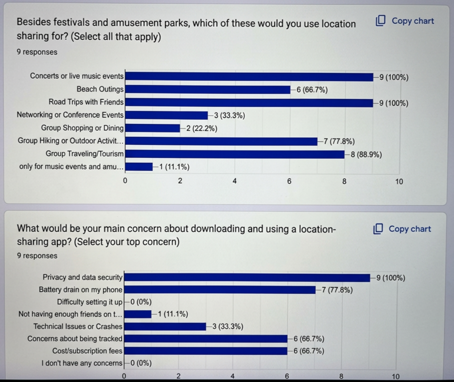
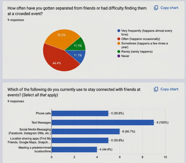
Here is the Survey I sent out to 9 people to get instant data. VIEW SURVEY RESULTS
The full interview guide is here MY INTERVIEW GUIDE
Research Synthesis
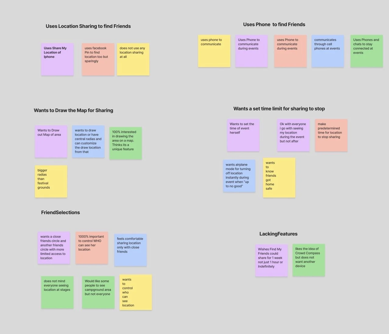
Using an affinity mapping methodology, I clustered interview notes into these recurring themes, then translated each theme into a design principle:
Visibility beats communication → prioritize the map view
Privacy is temporary trust → auto-expiring sharing
Users forget to turn things off → make the system remember for them
Battery is precious → keep the app lightweight and focused
Not every user is a festival user → design a universal visual language
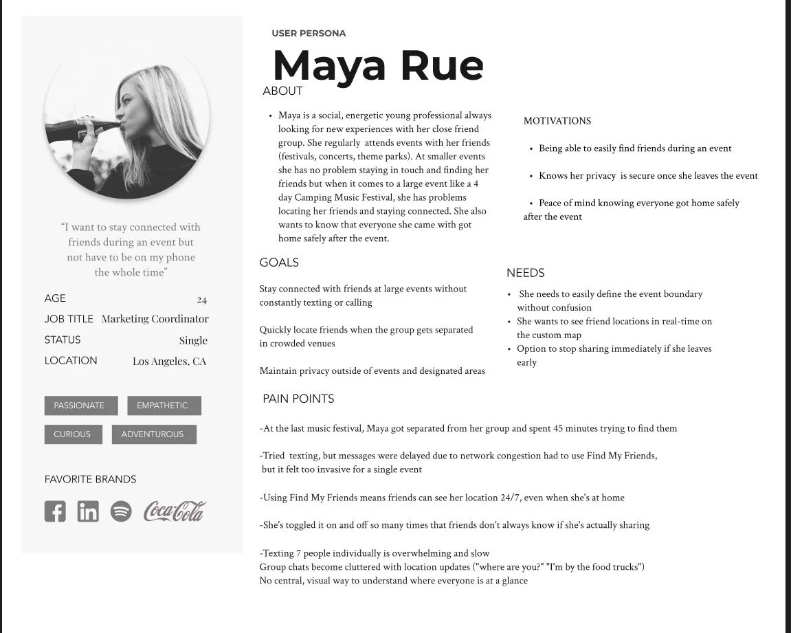
Persona: Maya Rue
Maya is a 28-year-old creative professional who attends 2–3 festivals a year. She loves her friends but values her independence. She wants to explore on her own terms — grab a drink, wander to a smaller stage — without becoming unreachable or feeling watched. After the event, she wants her privacy back automatically.
Maya became my north star. Every design decision was tested against a simple question: Would this make Maya's weekend easier?
Prioritization
I mapped features against user needs, technical feasibility, and impact. For V1, I focused on:
A rock-solid location map — the core value
The boundary-setting feature — the differentiator
Event creation and friend invitations — the essentials
Everything else — SOS, "I'm Lost," smartwatch pairing, festival partnerships — went into a clearly documented backlog for future releases.
This restraint reflects aesthetic and minimalist design every feature in V1 earns its place, and nothing competes for attention with the core experience.
Problem Statements
Maya needs a way to share live locations with her group of 8 friends during a weekend festival so she can stop being the group's human GPS.
Maya needs an efficient way to share her location within festival grounds so she can explore independently while still tracking her friends.
Reflection
Orbit was the project where UX really clicked for me. I learned that the best design decisions are almost never the flashy ones — they're the quiet ones that remove friction the user never notices. The automatic boundary shutoff, the color-coded rings, the persistent back button — none of these features will win awards, but they're the reason Maya's weekend would actually feel easier.
I also learned to trust the research. Nearly every meaningful design decision in Orbit traces back to a specific participant sentence or an affinity-map cluster. Designing from intuition alone would have produced a beautiful festival app. Designing from research produced something with a much wider future.
I'd love to continue developing Orbit into a fully built product. The foundation is strong, the demand is real, and there's a clear roadmap of features — SOS alerts, smartwatch pairing, festival partnerships — waiting for their moment.
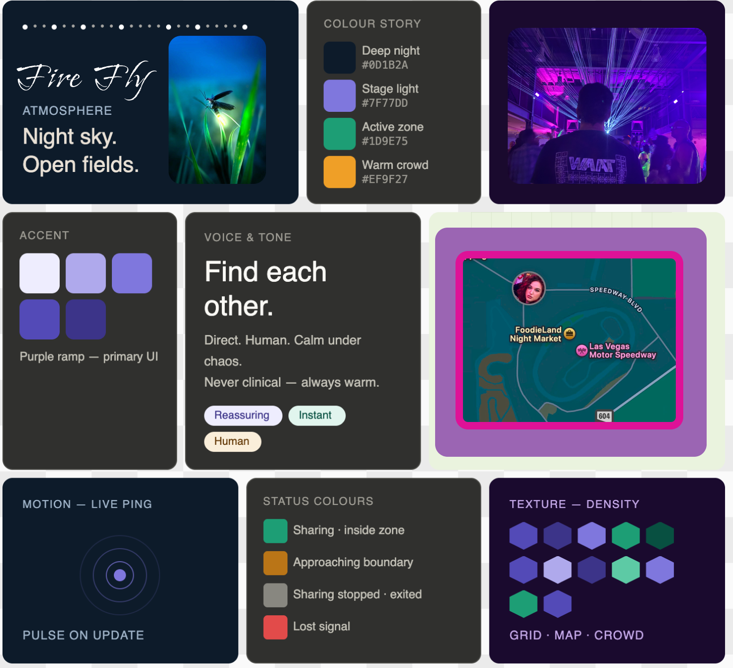
Mood Board
Key Insights From Interviews
This is where the project really took shape. The interviews surfaced patterns I couldn't have predicted from surveys alone.
Insight 1: Calls and texts fail exactly when you need them most
Nearly every participant described the same failure loop — calling a friend at a loud event, not hearing the ring, texting instead, waiting, giving up. One participant said she'd once spent almost an hour looking for her group before giving up and going home. That story shaped my belief that Orbit needed to be visual-first: a glance at a map should replace a phone call.
Insight 2: Privacy fatigue is real
Several participants mentioned forgetting they had shared their location with someone months ago. That "leftover sharing" feeling made them hesitant to turn sharing on in the first place. This insight became the foundation for Orbit's automatic boundary shutoff — the single feature that most differentiates it from competitors.
Insight 3: Battery anxiety shapes behavior
Multiple participants said they turn off location sharing at events precisely when they need it most, because they're trying to preserve battery. This pushed me to design the boundary feature as efficient by default — sharing only within a defined space, not continuously across the whole world.
Insight 4: Subscriptions are a hard sell
Users weren't willing to pay a monthly fee for basic sharing. However, they were open to premium features like:
An "I'm Lost" distress button
Festival partnerships with exclusive event maps
Smartwatch pairing with heart-rate and emergency alerts (a brilliant suggestion from one participant)
These became my future roadmap, not V1 features.
Insight 5: The use case extends far beyond festivals
When I pitched the concept, participants immediately imagined using it for beach days, weddings, ski trips, tailgates, family reunions, even conferences. That reaction changed my branding strategy — I stopped designing "a festival app" and started designing a lightweight, universal tool for any temporary shared experience.
UI Interaction & Design Choices
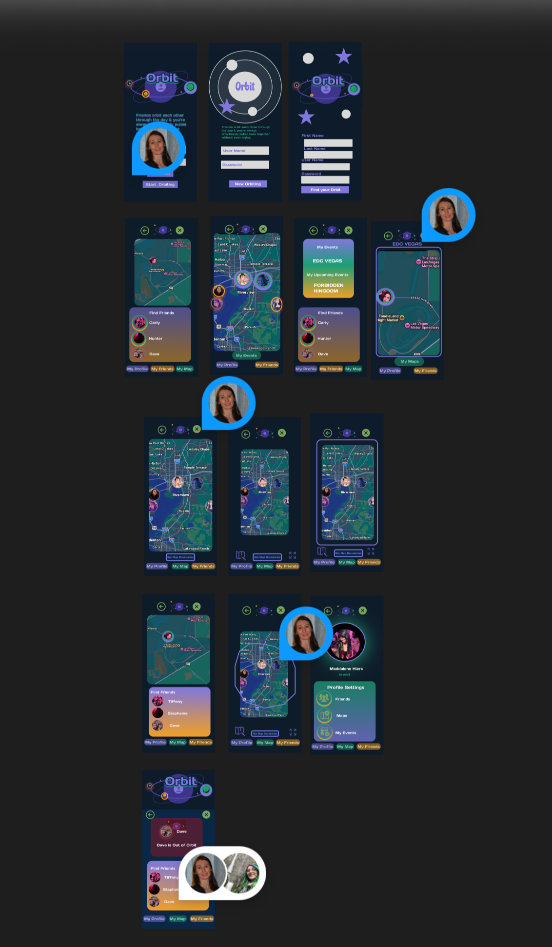
Moving into high fidelity, several key design decisions shaped the final product:
Color-Coded Orbit Rings
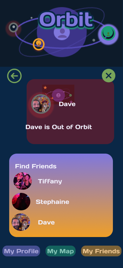
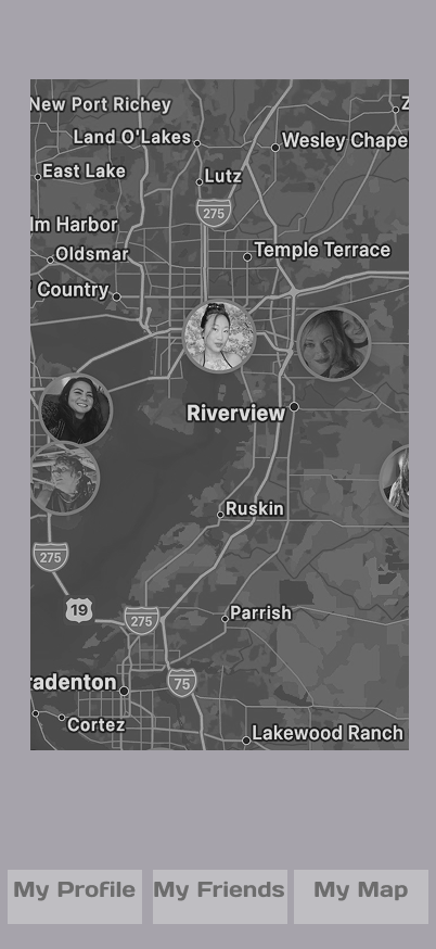
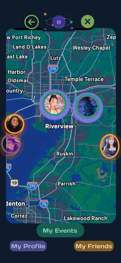
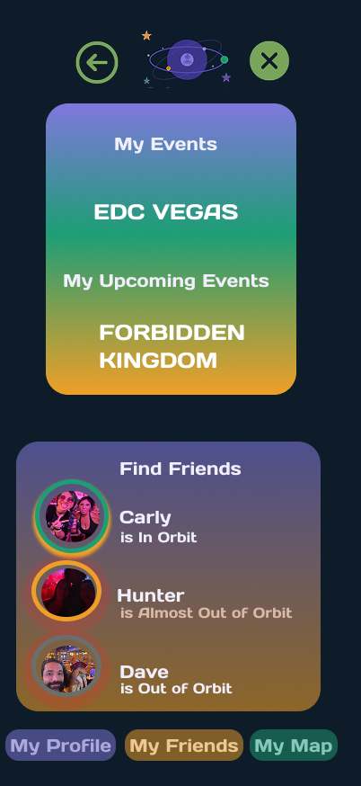
Each friend's avatar sits inside a colored ring indicating their status — "In Orbit" or "Out of Orbit." This gives users instant, glanceable feedback about who is within reach, directly supporting visibility of system status. No menus, no toggles — just a quick look at the map.
Warm Accents Over a Cool Base
My original palette leaned entirely cool, which felt cold and technical. Introducing orange accents brought warmth and energy — appropriate for an app centered on friendship and social experiences. The contrast also made calls-to-action stand out immediately.
Boundary-Drawing Flow
This is the feature Orbit is built around, so I gave it dedicated real estate. Users can either freehand-draw a shape or select a preset radius. Both options end with a clear confirmation screen showing exactly what was drawn — supporting error prevention before users commit.
Persistent Top Navigation
A back button lives in the top-left of every screen, and primary navigation stays anchored at the bottom. This decision came directly from Round 2 mid-fi testing, where users repeatedly felt trapped.
High-Fidelity Testing
I recruited 5 new participants for the high-fidelity round.
Their feedback led to:
Expanded map-setting screens allowing users to draw a custom shape or select a preset radius.
Additional visual confirmation when a boundary is set.
Small typographic refinements for readability on darker screens.
V1 Out of Orbit page
Map Boundary EDIT Page
Handoff
The final version delivered a cohesive, tested product featuring:
A refined color palette with warm accent balance
Color-coded status rings for at-a-glance clarity
Consistent iconography and navigation across every screen
A complete boundary-drawing flow with multiple input options
A polished dark-theme space aesthetic
I did a final self-guided prototype walkthrough to verify every interaction, and the result exceeded what I originally sketched in low fidelity.
UI Kit
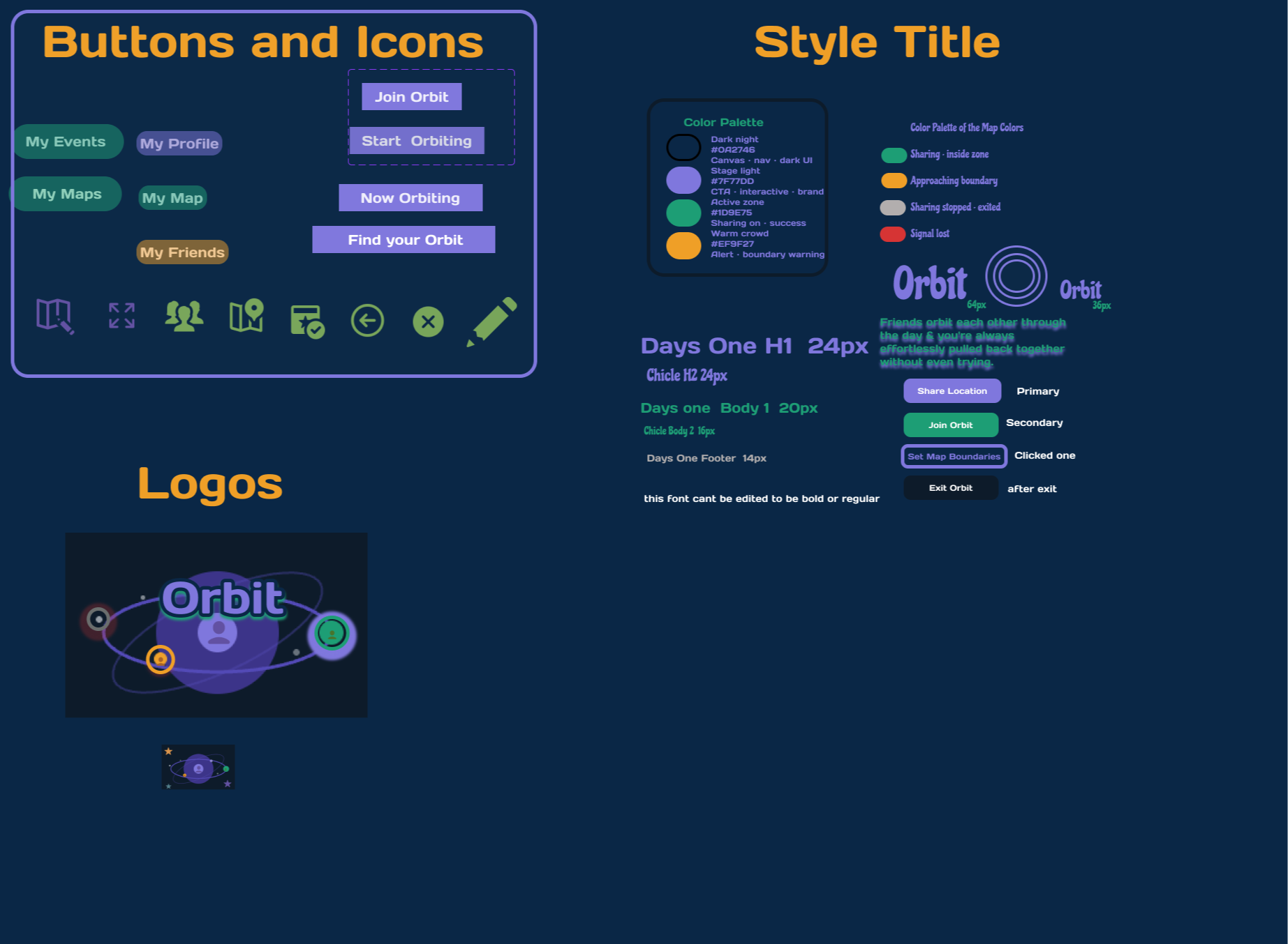
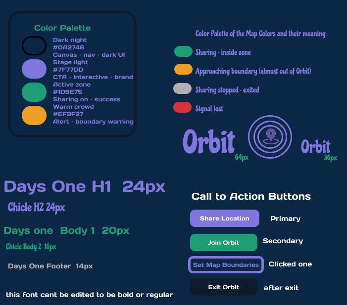
A comprehensive UI kit documents every design token used in Orbit:
Typography system
Call-to-action button states
Icon library
Color palette with hex numbers
This documentation supports help and documentation and ensures a smooth handoff to future developers.
MY UI KIT
Survey Findings
Testing & Iterations
Low Fidelity
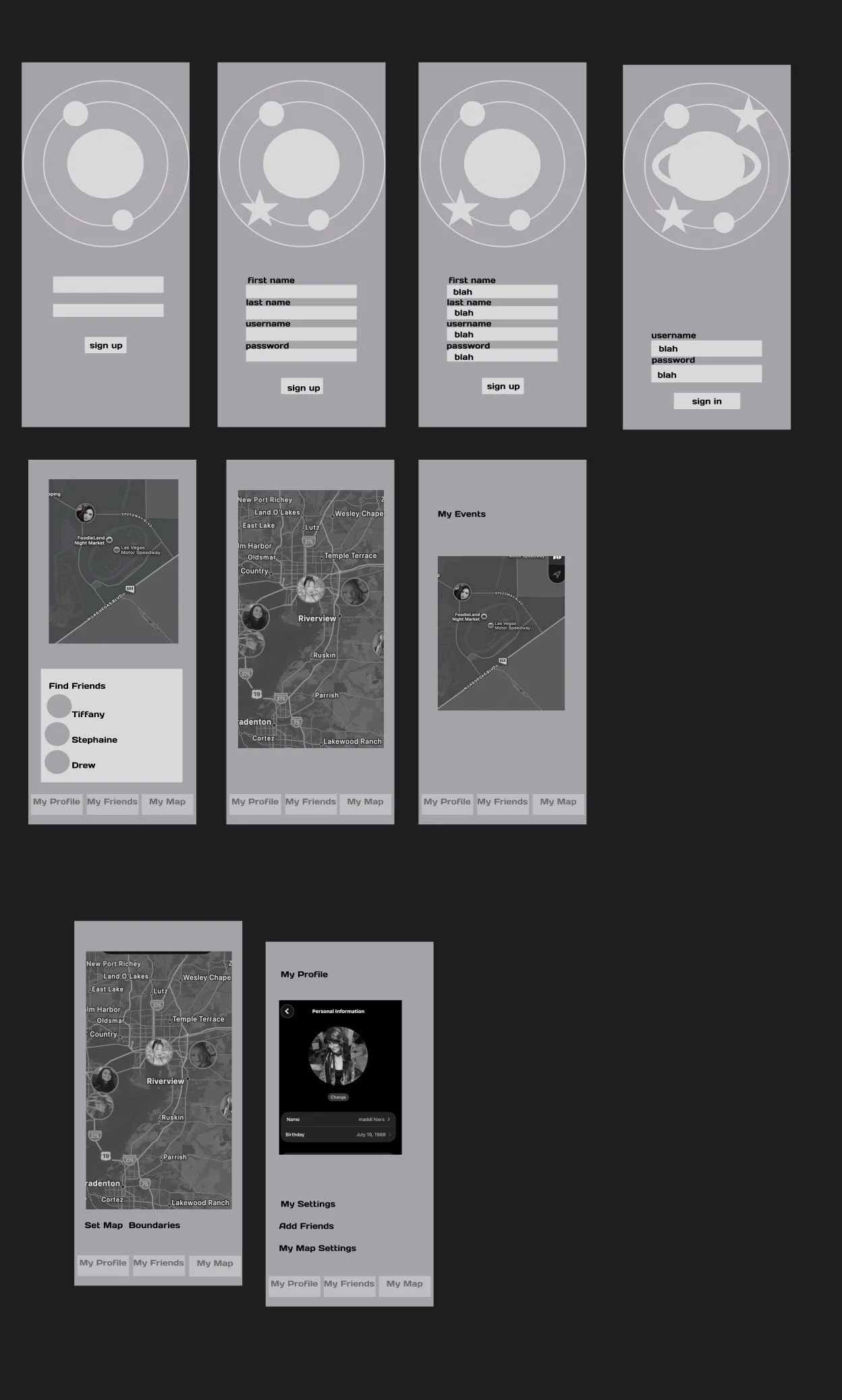
I started with hand-drawn sketches to work through screen sequencing before committing to any digital work. This is where I learned that the boundary-drawing feature needed more screens than I originally thought — users needed clear steps: choose a location, define the shape, confirm the area.
Mid Fidelity (Figma)
I built a clickable prototype to validate navigation and interaction patterns.
Round 1 — 3 participants:
Users struggled to navigate between screens.
The Orbit logo was being clipped on several frames.
What I changed: Repositioned the logo and repaired broken navigation links.
Round 2 — additional testers, more painful feedback:
Icons and buttons lacked visual consistency across screens.
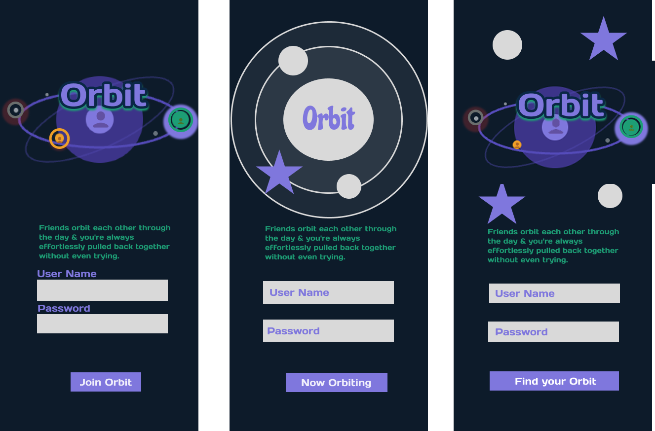
Onboarding screens had no descriptive text — users had no idea what they were looking at.
No back button existed on any screen.
One tester tapped a "Map" button while already inside the map view — a redundant control I hadn't noticed.
Design decisions that came out of this round:
Standardized icons and buttons across all screens — reinforcing consistency
Added clear descriptive text on onboarding — matching between system and real world. Users shouldn't have to guess what a screen is for.
Introduced a persistent back button — giving users a visible "escape hatch" on every screen.
Removed the redundant map button from within the map view — trimming noise to elevate the important controls.
Each round of testing genuinely humbled me. I'd stare at my own designs and see logic everywhere; users would tap once and find friction I couldn't see. That gap between designer intuition and real user behavior is exactly why testing exists — and it's become my favorite part of the process.
Branding
Naming
My first working name was Festie Finder. It felt fun but far too narrow. Once interviews revealed how many non-festival use cases existed, I knew the name had to evolve.
Orbit captured the concept perfectly. Friends move independently, but stay within each other's gravitational pull. The word is universal — it works for a festival, a beach, a wedding, or a hiking trip.
The metaphor also unlocked the app's visual language. Friends are either:
"In Orbit" — within your shared radius
"Out of Orbit" — outside the boundary and no longer visible
That simple binary made the entire product easier to design and easier to explain.
Logo & Visual Identity
Theme: Cosmic, space-inspired
Palette: Dark base with warm orange accents to balance the coolness
Logo: A planet formed from clustered people icons — communicating community and shared location at a single glance
I wanted the logo to work as a mini narrative. You should be able to look at it and instantly sense what the app is about, even before reading the name. That supports recognition rather than recall — users don't have to memorize a brand story to understand the product.
Main Map Page
Before and After
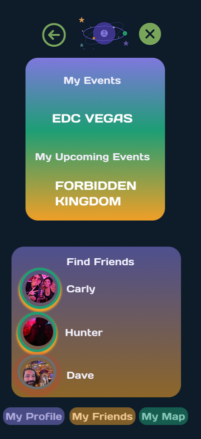
My Events Page Before and After
I added text to show what the color coded rings around each friend means so there is less confusion
Information Architecture and Flows
I created a site map to define core navigation, followed by dedicated user flows for:
Creating an event
Inviting friends
Setting map boundaries (my primary focus)
The boundary-setting flow received the most attention because it represents Orbit's unique value proposition — and because no other app in my competitive audit had solved it. This flow was carried through every fidelity stage.
Consistent flow logic across the app reinforces consistency and standards so users only have to learn Orbit's language once.