TiriVelo Inc Admin Onboarding
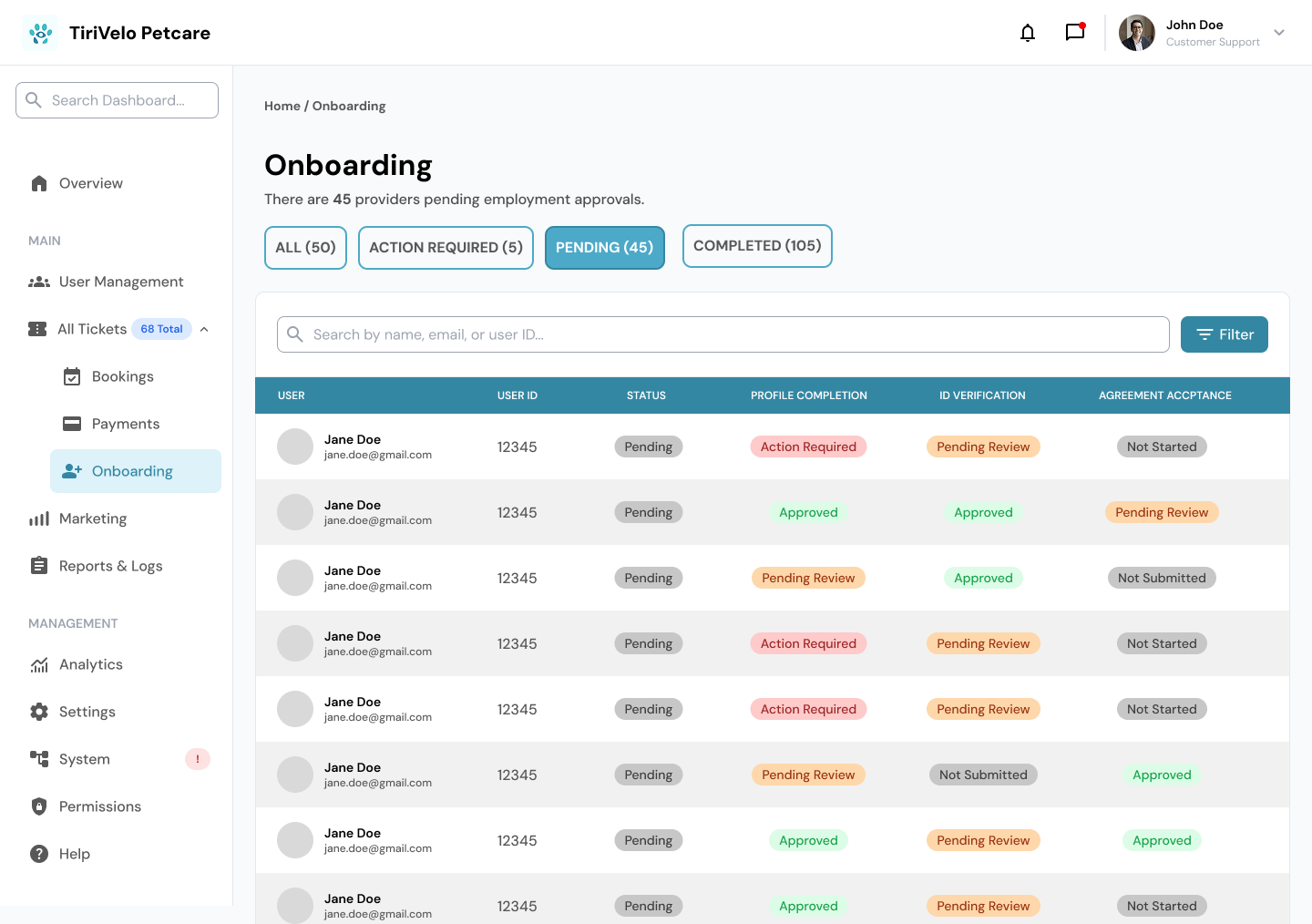
Prototyping and Iteration
We didn't get the chance to run formal usability testing with outside participants, since our timeline ended with a handoff to a new team. I did test the flows myself to confirm buttons led where they should, though I ended up re-testing more than once as our navigation system evolved.
Key decisions during this phase:
Converted all page designs into interactive prototypes for developer handoff.
Shifted priority to Provider onboarding based on stakeholder guidance, and built a tested prototype for that flow.
Introduced consistent top-level tab navigation across all admin pages, updating Onboarding screens to match Booking and Ticketing (V3).
Standardized the right-pane placement of admin actions across Ticketing, Booking, and Admin Onboarding.
Componentized verification patterns for Provider IDs, Certificates, and Background Checks.
Shu prototyped the full Lost Pet ticket flow during this same window, and Em's component library kept pace with all of it, which made rebuilding my screens far less painful than it could have been. This stage reinforced Error Prevention for me. Catching inconsistencies before handoff meant the next team would inherit a system, not a puzzle.
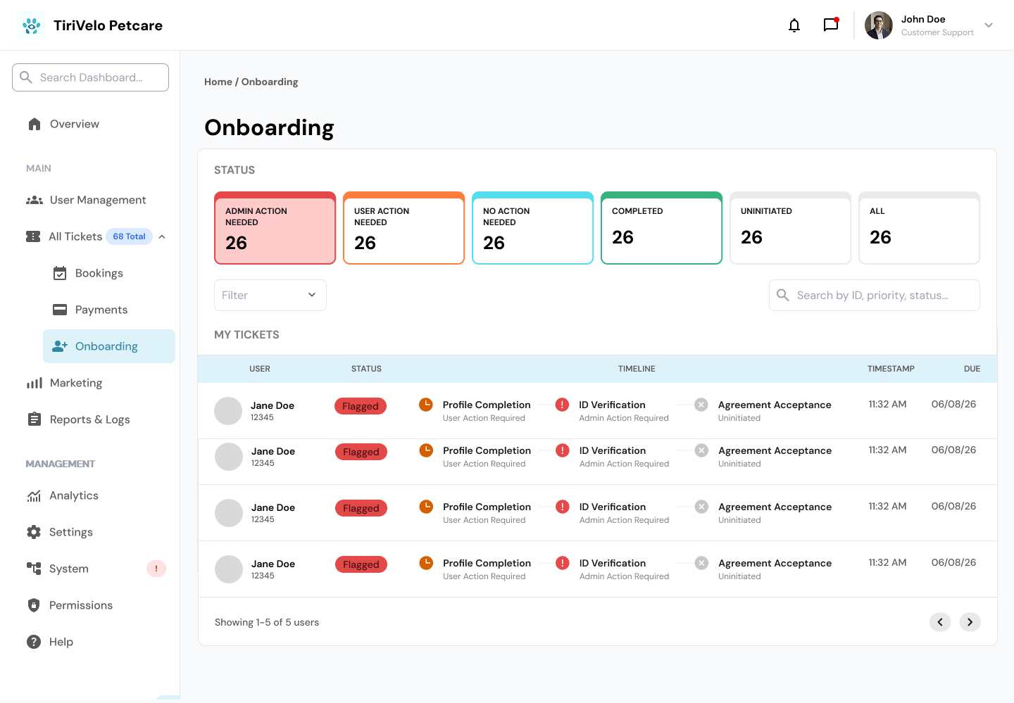
New ADMIN ACTION NEEDED ONBOARDING SCREENS
NEW ADMIN RESOLVED SCREEN
Building Pages


New ADMIN TABS and Components
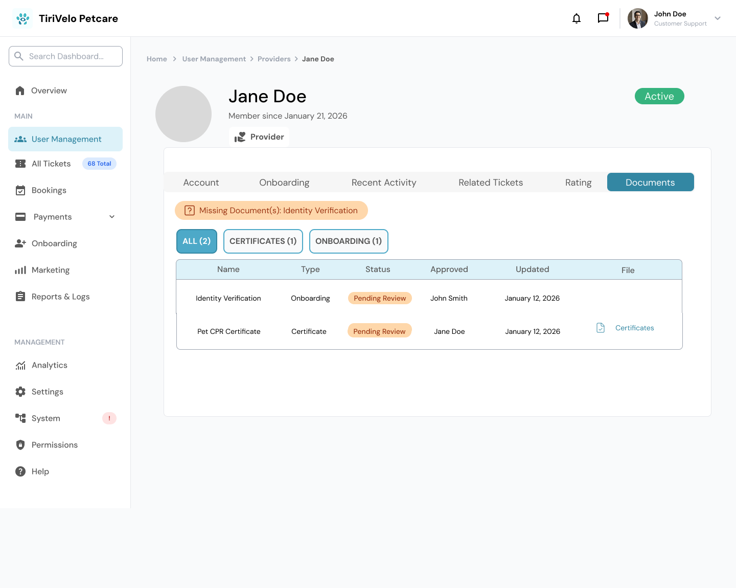
Documents Page and pending reviews
NEW Owner Account Screen
Added a Pets tab to show Owners Pet’s Information as well
A Team Collaboration for a Canadian Pet-Sitting Platform
Role: UX/UI Designer, Team of Three (Collaborative Project)
Methodologies: Design System Audit, Componentization, Information Architecture, Stakeholder Collaboration, Interactive Prototyping, Developer Handoff
TiriVelo Pet Services Inc. is a Canadian company built around a simple idea: pets and their owners deserve trust and joy in every interaction. Their team offers everything from dog walking to overnight house sitting, and they were preparing to launch a full site and app when our team stepped in. Our job was to take their Admin pages, which were still incomplete and inconsistent, and get them ready for developer handoff before launch.
I worked alongside two other designers, Em and Shu, over five weeks. We split our time between building components together as a unit and each owning a section independently, which meant learning to trust my teammates' decisions just as much as my own.
They are working on launching their site and app soon. Our main focus was on the Admin pages that still needed to be built out and prototyped before they can officially launch.
My Team of Three worked on unifying all the previous work to be consistent with color coding and components for each card and part of the site for 5 weeks. We also divided up tasks and each tackled a section on our own as well to make sure we were doing the most we could with the time we had available to us.
I worked on prototyping the Admin Onboarding section and building out pages for the owner onboarding,
The other members of my team Em and Shu worked on building out components for each section and on the booking and ticket sections.
Together I feel like we were able to cover a lot of ground and deliver some prototype flows to show the developers which will help keep the site on track for its launch.
Old Onboarding Pages
Old Tab System was all just blue and not color coded for the new system.
Objective 2: Workstream Ownership
Once the system was in place, we divided the remaining work based on our strengths. I led the Admin Onboarding flow, including owner onboarding screens and document verification for certificates and background checks. Em standardized the UI components across the admin experience, building a reusable library that the rest of us leaned on constantly. Shu focused on Tickets and Booking, including the full flow for a Lost Pet ticket.
Working this way taught me a lot about Flexibility and Efficiency of Use. Once Em's components existed, building new screens became noticeably faster, and I could focus more energy on flow logic instead of rebuilding basic elements from scratch every time.
Partway through, We noticed the Ticketing and Booking dashboards both used a tab system, with all admin actions placed on the right side of the screen. To keep the experience consistent, I rebuilt my Onboarding pages to follow that same pattern, even though it meant redoing work I'd already finished. It wasn't the most exciting part of the process, but it mattered more to me that the final product felt like one cohesive system rather than three designers' separate visions stitched together.
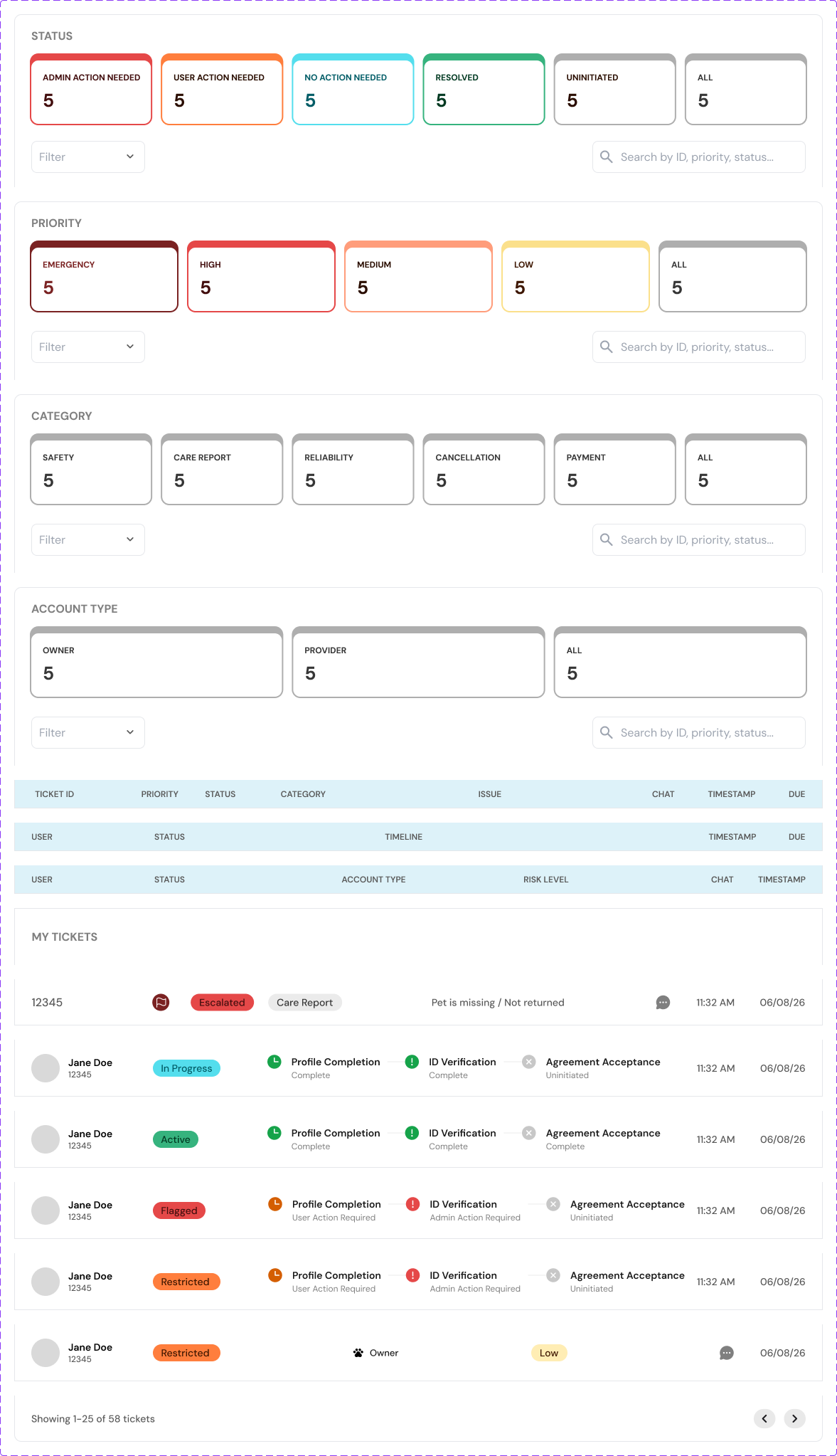
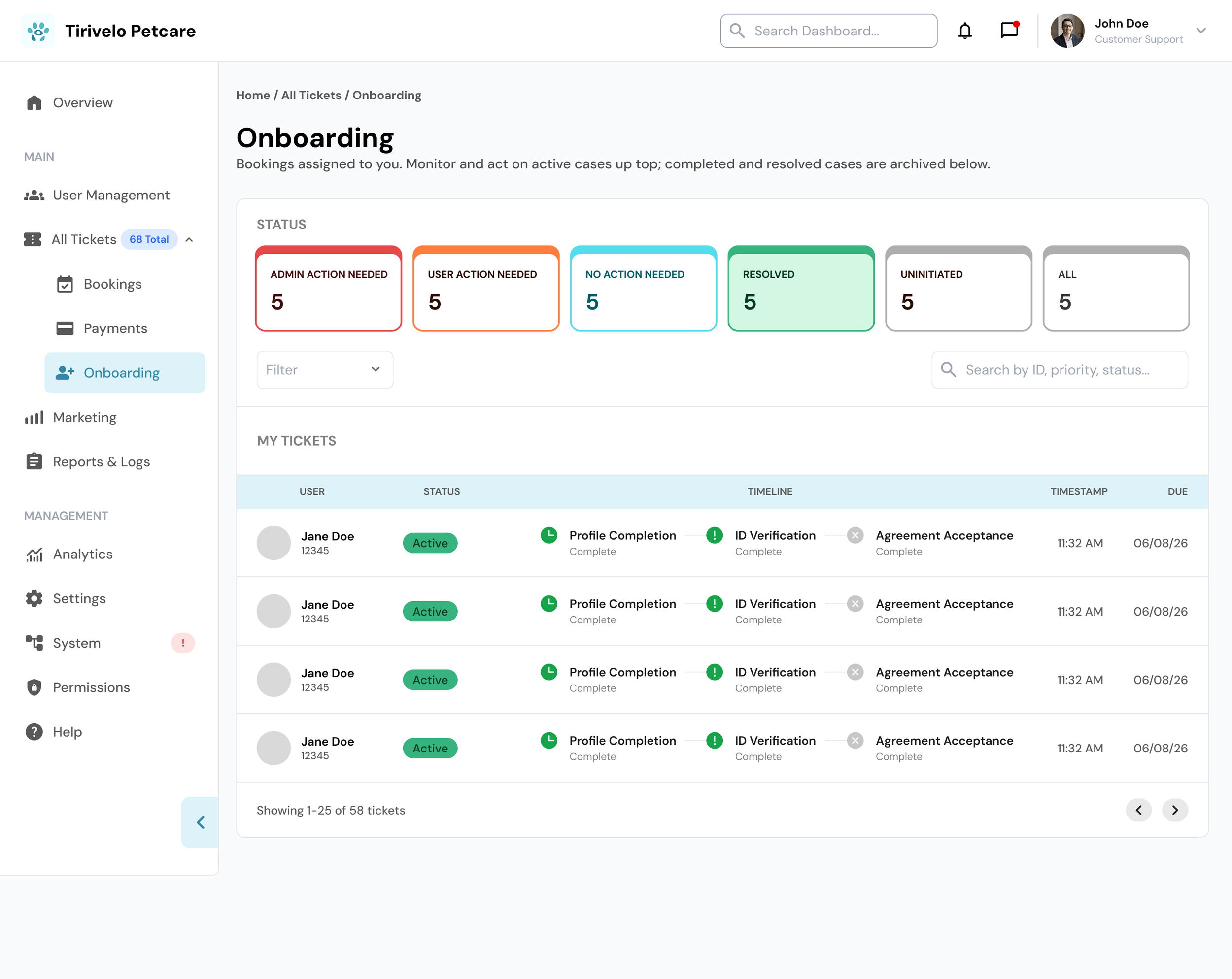
NEW Color Coded ADMIN TABS and Timeline Progress Components
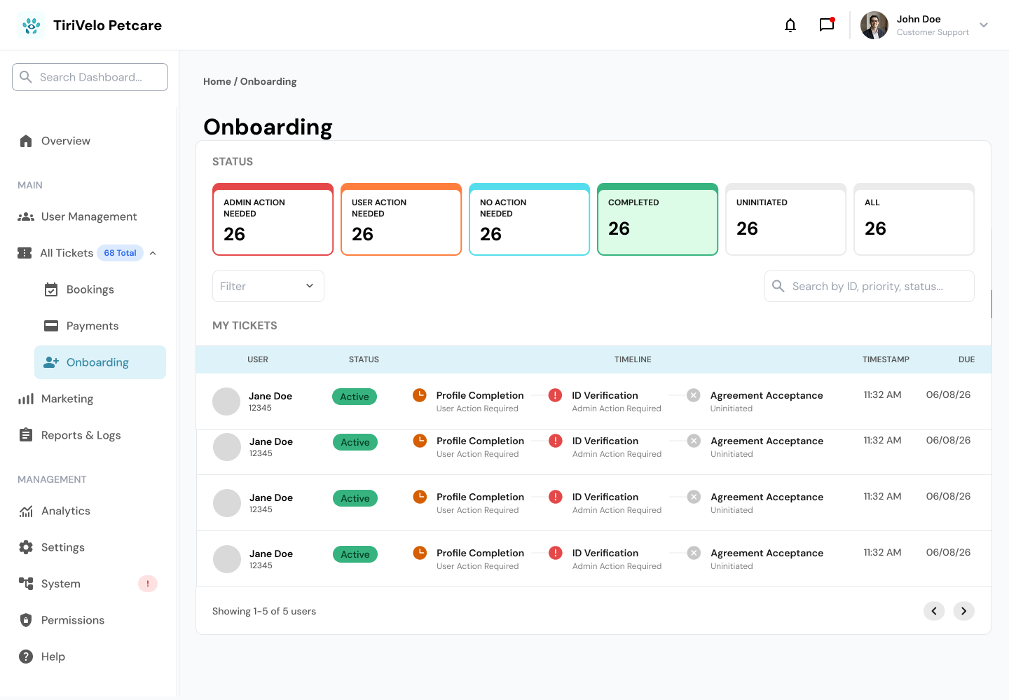
New Onboarding Screens with New TAB system at top
New TAB system at top that is color coded with new drop down Navigation on left hand side and new Timeline Progress components
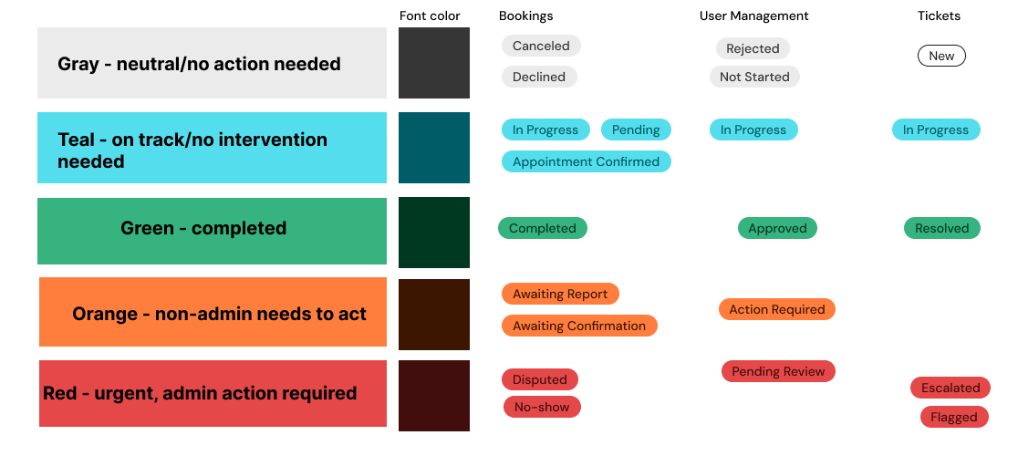
Color Coding System We Created
Objective 1: Establishing a Unified Design System
Before we ever met with the TiriVelo team, the three of us sat down and combed through every existing Figma file together. What we found surprised me. Some sections used blue to indicate approval, others used green, and several pages had no color coding at all, just grey screens where priority was nearly impossible to read at a glance. Nothing had been turned into reusable components yet either.
We knew fixing this had to come before anything else. This decision reflects Consistency and Standards, recognizing that a scattered system would only create more confusion the longer it went unaddressed.
We built a shared color-coding standard together and applied it across every admin surface, so status colors would map to the same actions everywhere:
Grey — No action required
Teal — On track / In progress
Green — Complete
Orange — Awaiting non-admin action
Red — Urgent admin action required
When we presented this system in our first meeting with TiriVelo, their design team approved it on the spot, and it became the reference point for every screen we built afterward. That approval meant a lot to me. It confirmed we were solving the right problem before we ever touched a new page. From there, we built out components for nav bars, cards, and status action buttons, which supports Recognition Rather Than Recall, since anyone using the system going forward could rely on familiar visual patterns instead of relearning each screen.
Handoff
Wrapping up meant translating five weeks of decisions into something a completely new team could pick up without missing a beat. We held several meetings with the incoming designers and developers, walking them through the prototype flows, the color-coded system, and every component we'd built for tickets, bookings, and admin actions. There was a lot to cover, which is part of why it took more than one sitting to get through it all.
The new team had genuine questions, and I did my best to answer the ones tied to my part of the work. Most were curious about how TiriVelo had received everything, and I could say honestly that the feedback had been overwhelmingly positive. We were firm on one point: the design system didn't need to be rebuilt. It needed to be used.
When asked where to focus next, I pointed them toward the gaps I hadn't gotten to yet: the insurance verification screen, the remaining owner-side document flows, and the many branching paths a ticket or booking could take. I suggested a policy guide to help future designers understand escalation scenarios clearly, and I recommended accessibility testing as an immediate next step, since we hadn't had time to run it ourselves. This reflects Help and Documentation, making sure the next team had enough context to move forward confidently without us in the room.
The developers seemed genuinely excited by what they saw, and it was rewarding to watch that reaction after weeks of quiet, detail-heavy work. They even raised a question about handling partial payouts for disputes between owners and providers, which they were able to resolve on their own through TiriVelo's existing payment partner, so no design changes were needed on our end.
Conclusion
Looking back, I'm proud of the foundation my team built for TiriVelo. Handing off a project mid-process isn't always straightforward, but I think we left the next team with more clarity than confusion, and that mattered to me. Watching Em's components hold everything together, and seeing Shu's ticket flow come to life alongside my own onboarding screens, reminded me how much stronger collaborative design becomes when everyone commits to the same standard, even when it means redoing your own work more than once.
I'm genuinely excited to see where TiriVelo goes from here.
Below is some Feedback we received from TiriVelo
“It has been a pleasure working with this Designlab team on the Admin Dashboard Refinement Project for TiriVelo. Throughout the project, the team demonstrated a high level of professionalism, creativity, and collaboration while refining and enhancing our internal platform. They were receptive to feedback, communicated effectively, and consistently approached design challenges with thoughtful, user-centered solutions. I especially appreciated their willingness to iterate on ideas, explore different approaches, and continually improve the quality of their work. Their attention to detail and commitment to creating intuitive experiences made them a valuable extension of our Product Design team. Beyond the final designs, the team embraced a collaborative process—working closely with stakeholders, incorporating feedback throughout the project, and maintaining a positive attitude from start to finish. We sincerely appreciate the time, effort, and passion they invested in helping shape the future of TiriVelo, and I have no doubt they will continue to make meaningful contributions wherever their careers take them. I would happily recommend this team to any organization looking for talented, collaborative, and thoughtful product designers.” - Michael
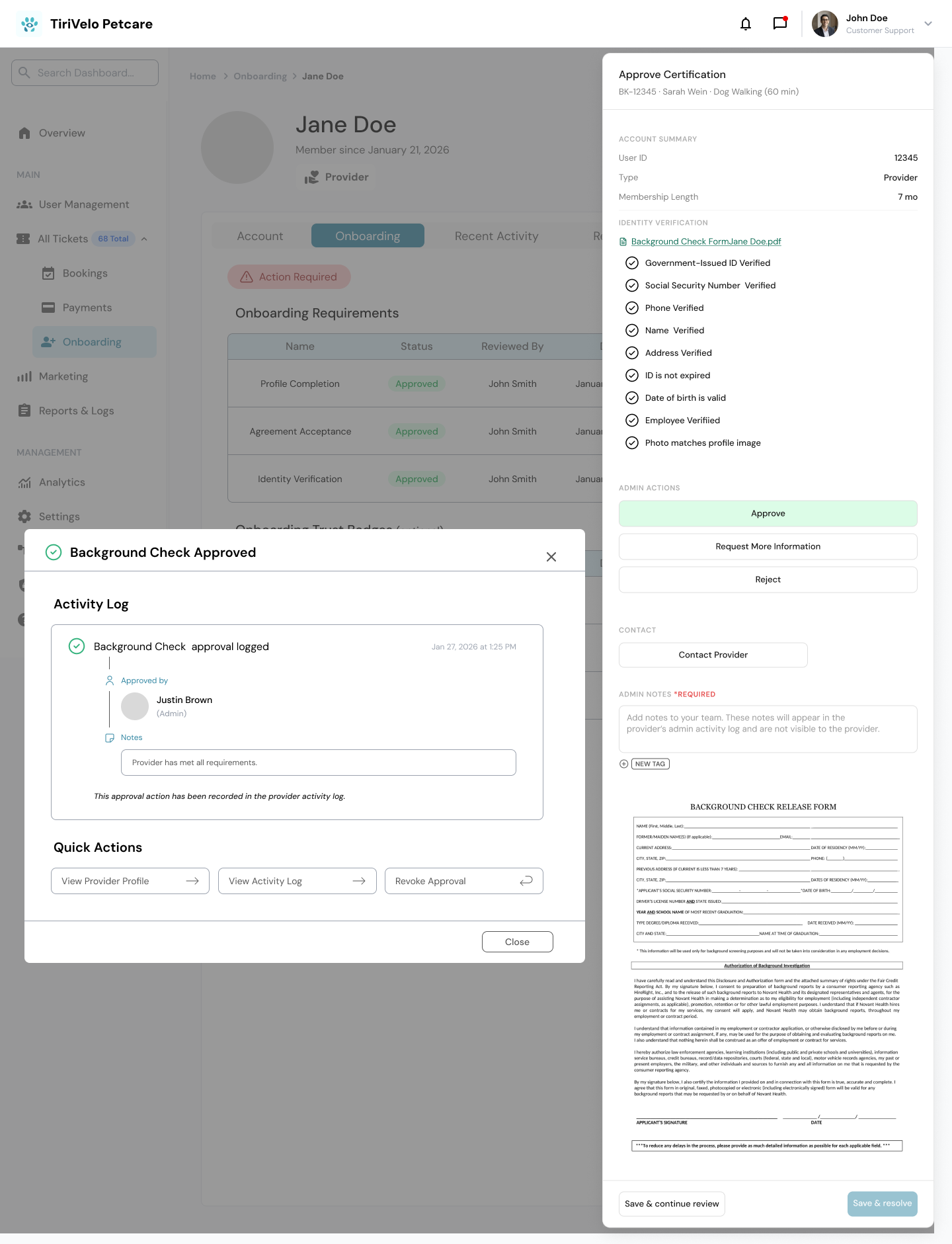
BACKGROUND CHECK APPROVAL SCREEN
Actions on Right hand side only now
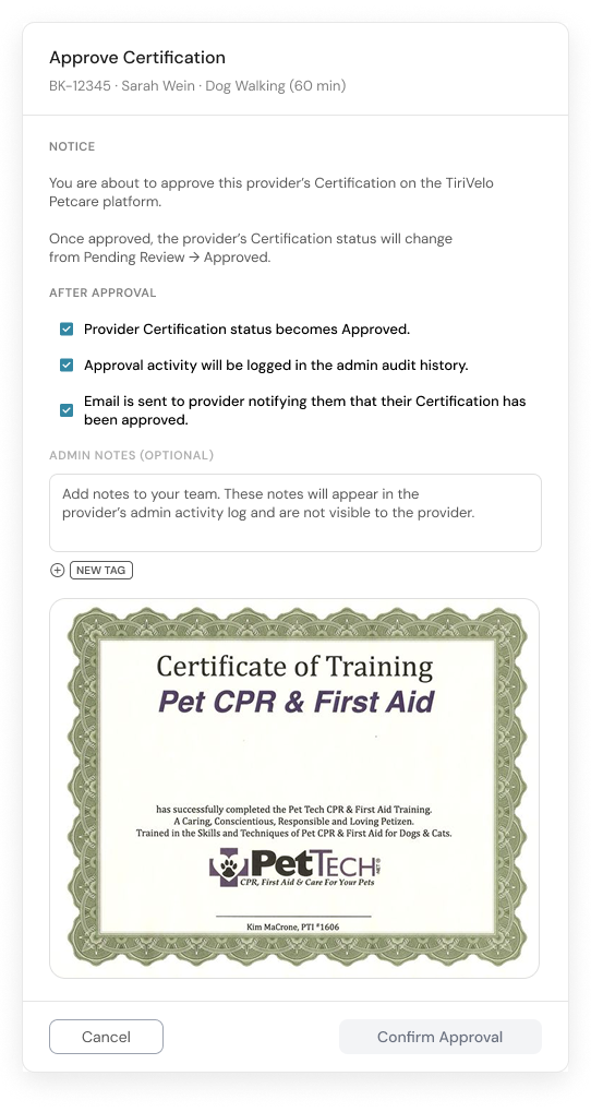
First CPR CERTIFICATE APPROVAL SCREEN
Old ID Approval Onboarding Screens
Admin Actions are in the middle of the screen and not on the right side like the booking and ticketing pages.

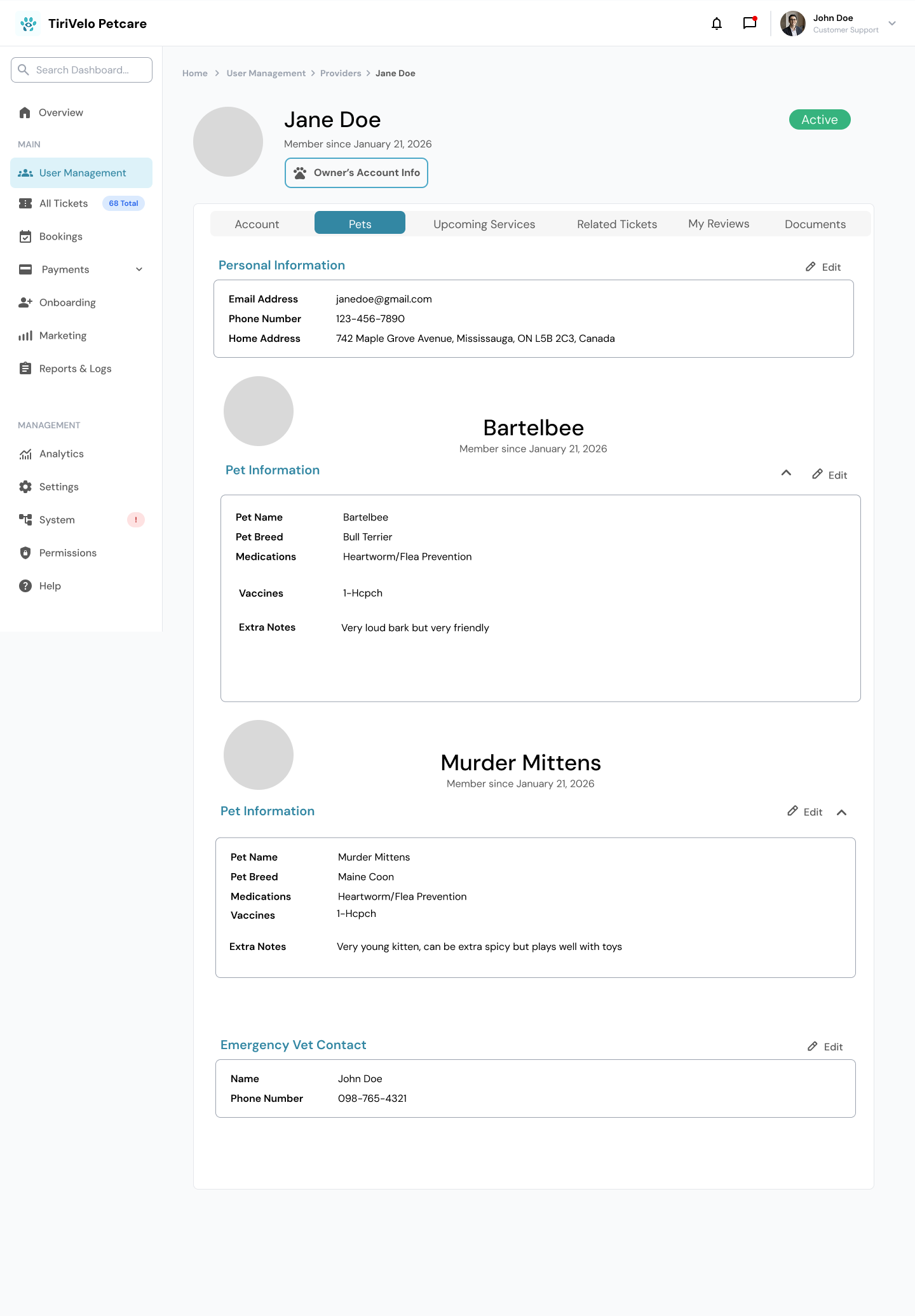
Since none of the Owner Onboarding screens existed yet, I built those from the ground up. Owners don't go through the same extensive verification process as service providers, so their screens stayed simpler, with a Pet tab replacing the onboarding tab entirely, since editing pet information was the main task admins needed.
From there, I built out the document upload and verification screens for certifications, background checks, and government IDs, along with the prototype flow for processing each one. None of these screens existed before, so I leaned on the patterns already established elsewhere in the system to keep everything visually and functionally consistent. This reflects Match Between System and the Real World, designing verification steps that mirrored a process admins would already recognize from real-world document review.
After a team check-in, I realized my screens still didn't fully match the right-hand action placement used in Ticketing and Booking, so I redesigned most of them again, along with the top navigation tabs, to close that gap. We also built out components for the color-coded visual timeline bar that appears throughout onboarding, which was one of my favorite pieces to help design.
Documents Screen

New CPR Certificate Approval Card
Actions on Right hand side only now
NEW ID Approval Onboarding Screen
Admin Actions on right hand side